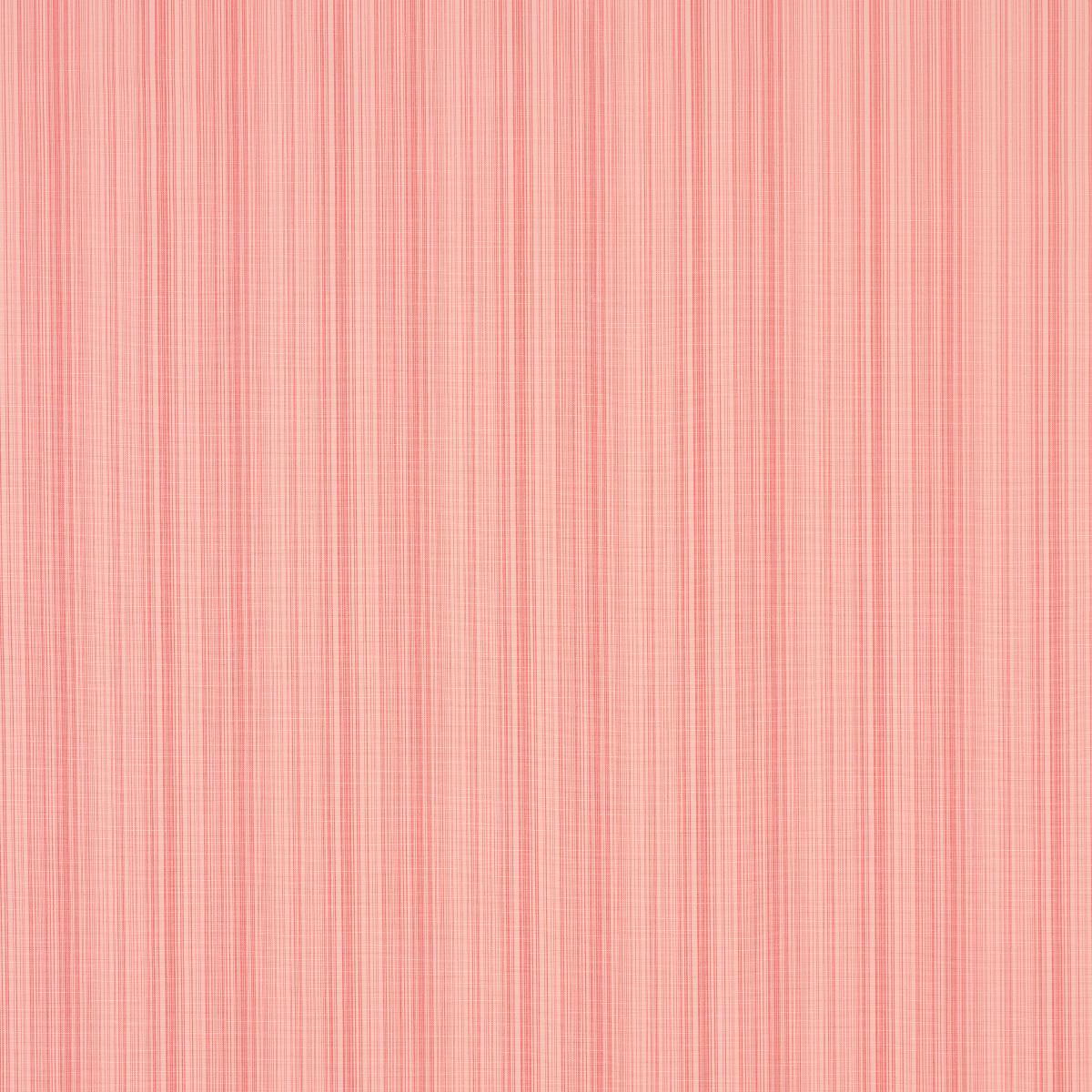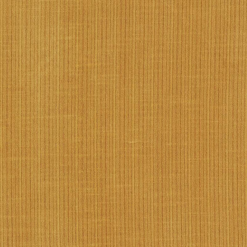
Schumacher’s Antique Strié Velvet fabric is rich with texture and dimension, featuring a lush pile and tonal striations that set it apart from solid alternatives.
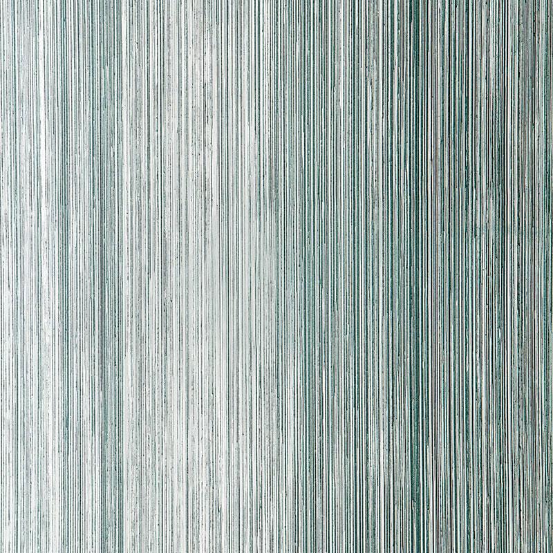
ANNIE SCHLECHTERWith delicate shifts in color and a fine-lined texture that gives the impression of a soft watercolor wash, strié fabrics are often referred to as painterly. It comes as no surprise, then, that they were inspired by traditional painting techniques. A very fine, irregular streaked effect made by a slight variance in the color of warp yarns, strié is more of a look than anything else: It’s not quite a pattern, like stripes, nor is it a specific weaving technique. Striés can be woven from any fiber—cotton, wool, linen, silk, synthetics, and blends—and examples can be found in nearly every category: velvets, sheers, satins, damasks, indoor-outdoor, and more.
To understand how strié came to be applied to such a wide variety of textiles, it’s helpful to look at the history of the word. Although French, the word strié likely evolved from the archaic Italian architectural term stria, which was used to describe classical fluted columns and pilasters and eventually applied more broadly to virtually any pattern of minuscule parallel lines, from seashells to wood grain or anything made with a fine trowel, file, or comb. The comb is key to understanding how strié also came to refer to a painting technique, with a look said to mimic everything from straight-grained wood to fine silk and rough linen. The strié effect is achieved by dragging a fine brush or comb through a glaze applied over a base coat of a related color. Used for centuries in Europe, the practice was revived in America in the 1980s, when decorative painting techniques were all the rage. Given the time-consuming process of hand-glazing walls, it’s only natural that many wallpapers, too, have since been designed to impart the same hand-painted impression.
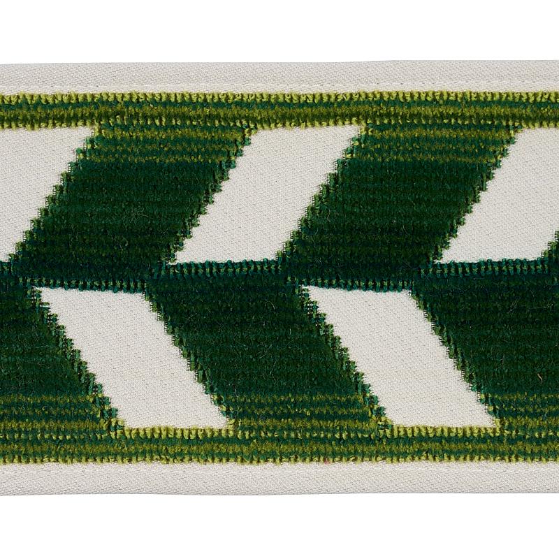
Available in three widths and a variety of handsome hues, Schumacher’s Cotton Strié tapes from sister brand Patterson Flynn add an extra-special touch to all your finishing needs.
KEVIN KERRThe Fine Line: Solid vs. Strié
Strié fabrics have long been beloved by tastemakers and decorators alike for their ability to function like go-with-anything solids, but with a slightly edgy flair. The subtle shifts in color can be created in multiple ways: using twisted yarns made of several colors; combining bobbins with light and dark gradients; employing multi-hued space-dyed yarns in both warp and weft. The result: a textured plane of color with an artisanal, hand-woven look. These super-sophisticated alternatives to solids, however, are still easy to pair with patterns, which explains why they’re found in heaps of interiors where a plain just wouldn’t do. A sofa upholstered in Schumacher’s Antique Strié Velvet sits in Jon Batiste and Suleika Jaouad’s Brooklyn living room; the legendary actress Mary Tyler Moore reportedly favored a club chair done in a strié fabric from Lee Jofa.
Strié wallpapers also rise to almost any decorating occasion: Martyn Lawrence Bullard chose a strié paper as a backdrop for a Keith Haring canvas that graces Elton John’s living room, and when Queen Elizabeth II overnighted in the Waldorf Astoria’s Royal Suite, she slept in a room swathed in strié. Designers, take note: While the striations can be applied horizontally or vertically, choose thoughtfully. Horizontal applications have a broadening effect, whereas vertical lines tend to lengthen. But whichever way you apply them, striés are guaranteed to stand out in a sea of solids.
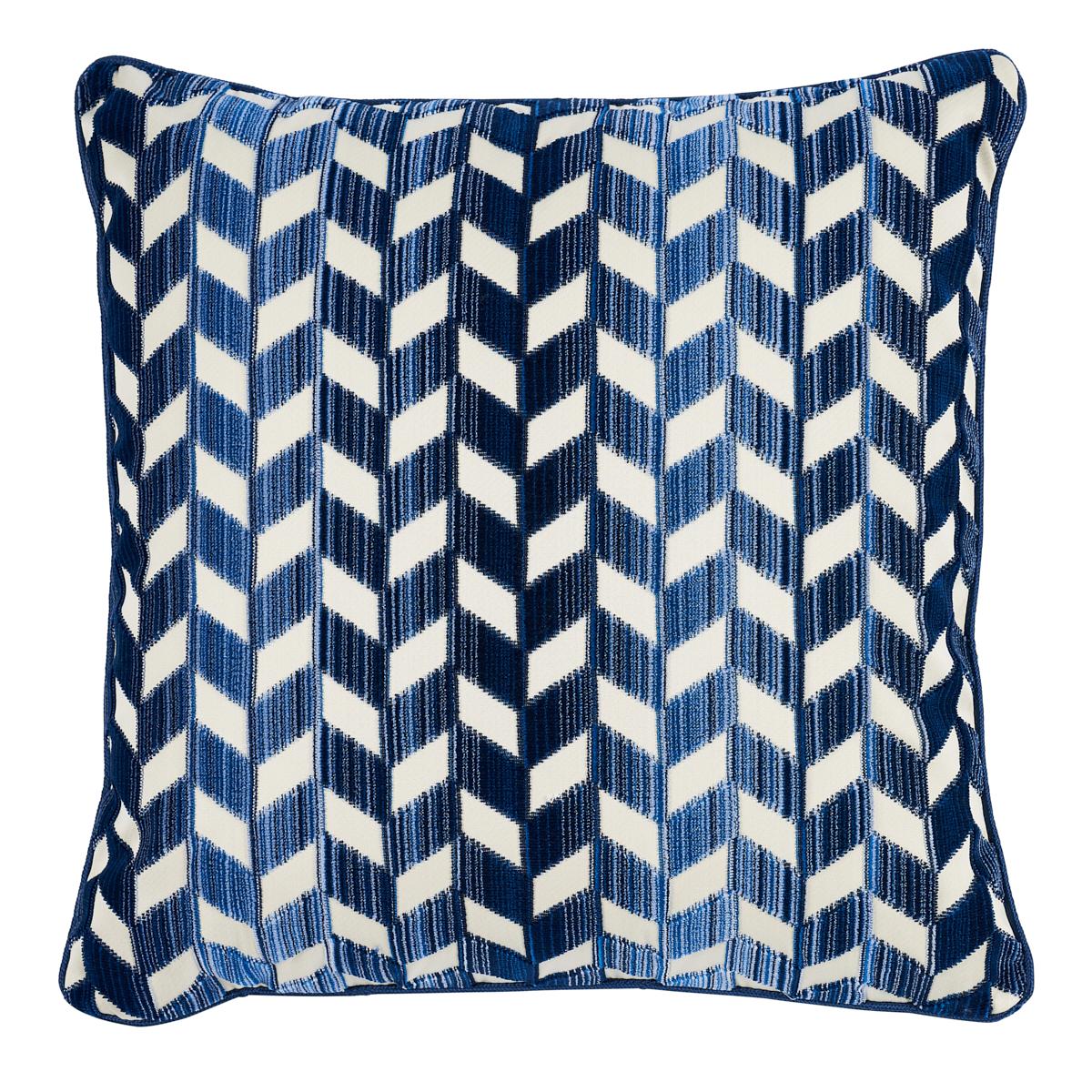
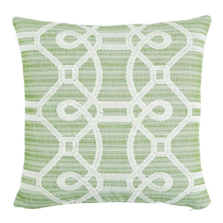
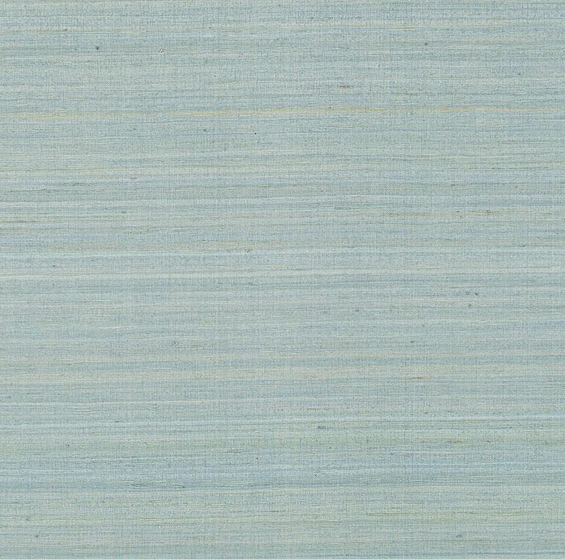
Several Schumacher designs embrace the subtly striped sumptuousness of strié, such as our Chevron Strié Velvet and Antique Strié Velvet, our Silk Strié wallpaper, our Cotton Strié tapes, and a whole lot more!